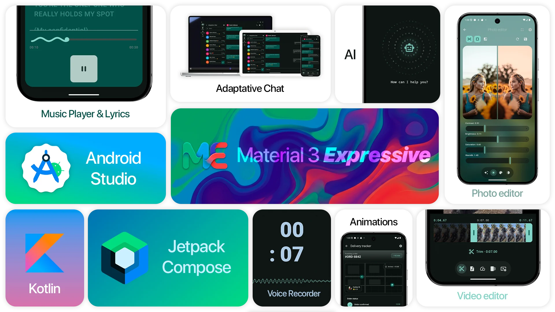
Material 3 Expressive is built to help you take your Android app to the next level in terms of design and
user
experience. By exploring its components and real-world implementations, developers can quickly
integrate modern UI patterns, improve usability, and create visually polished applications.
Features
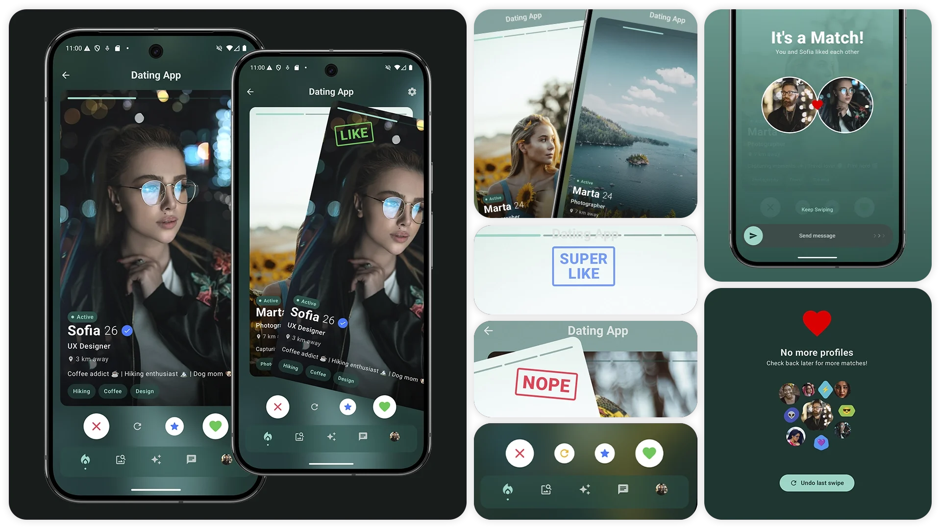
Demo Screens – Explore a wide range of Material 3 UI components.
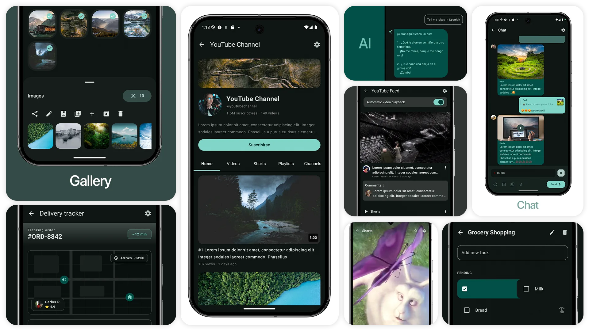
Chat – Messaging UI with replies and media (images, videos, audio and recordings)
Voice Recorder – Audio with animations and custom views
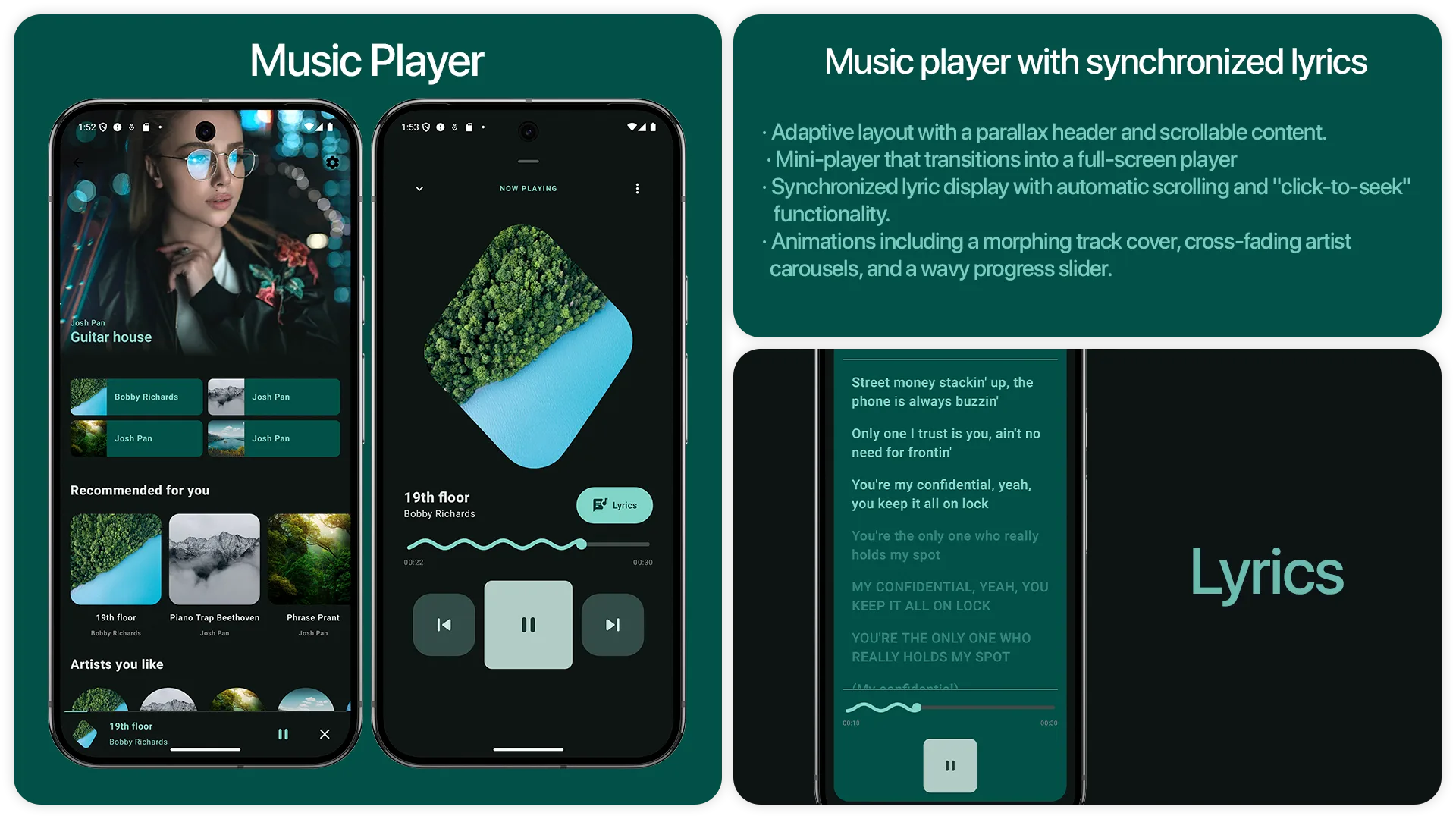
Music Player – Player with synced lyrics
YouTube Shorts – Vertical video feed
YouTube Feed – Video feed with autoplay and nested posts
YouTube Channel – Channel layout with nested scrolling
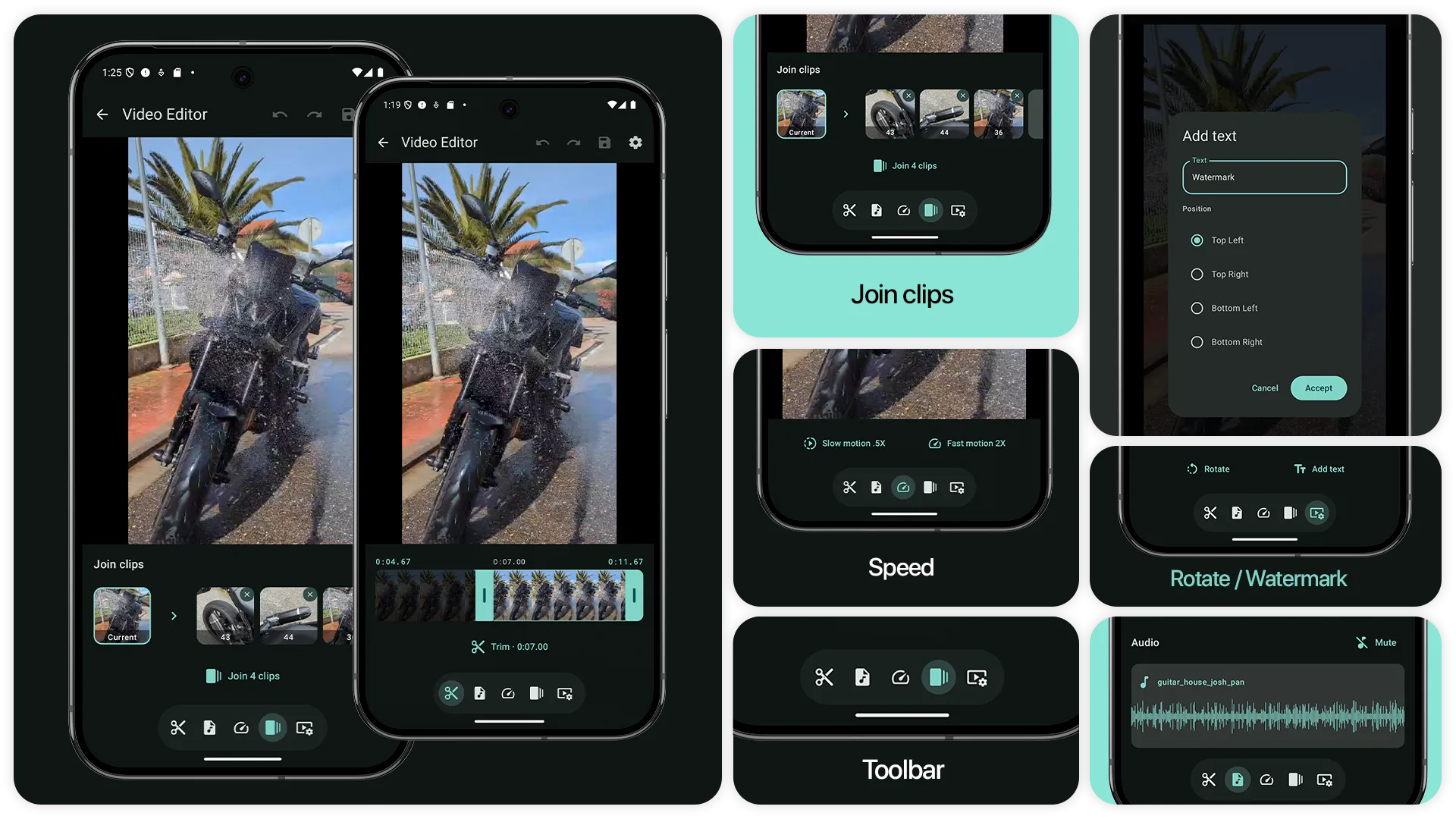
Video Editor – Trim, add background audio, mute, slow motion, fast motion, rotate, add text, join
clips, undo, redo and save video
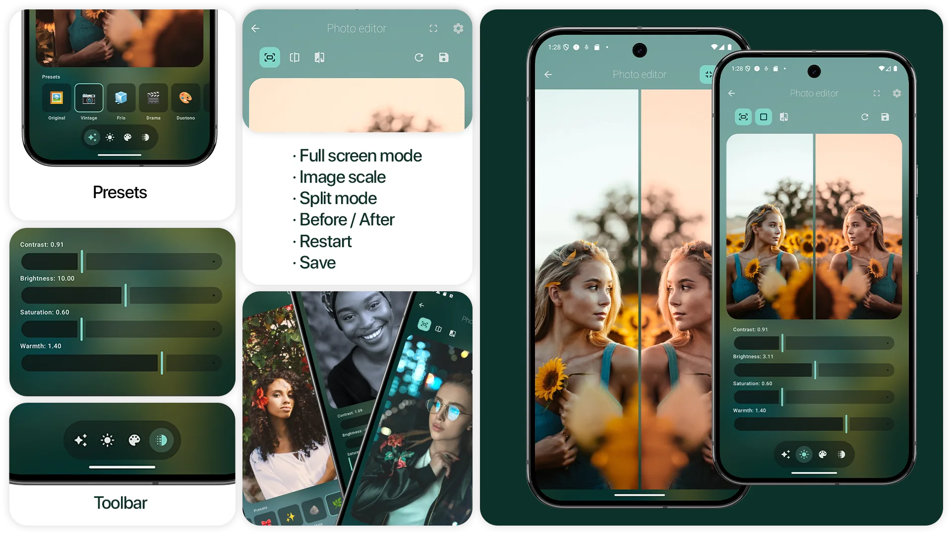
Photo Editor – Select presets, adjust brightness, contrast, saturation, warmth, modify red green
blur color, invert colors, flip horizontally and vertically, edit photo in split mode, toggle before and after,
reset edit and save photo
Gallery – Select images with animation, bottom sheet menu with preview images and modify grid
Todo List – Task management UI with swipe gestures(delete, mark as complete, mark as incomplete)
Delivery Tracker – Package tracking interface with animations
Components
Navigation
Navigation Bar – Bottom navigation
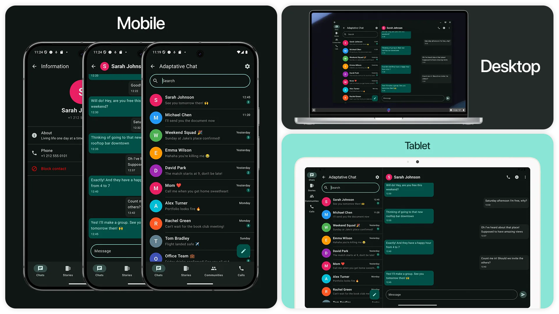
Navigation Drawer – Side navigation for large screens
Navigation Rail – Mid-size device navigation
Tabs – Tab-based content navigation
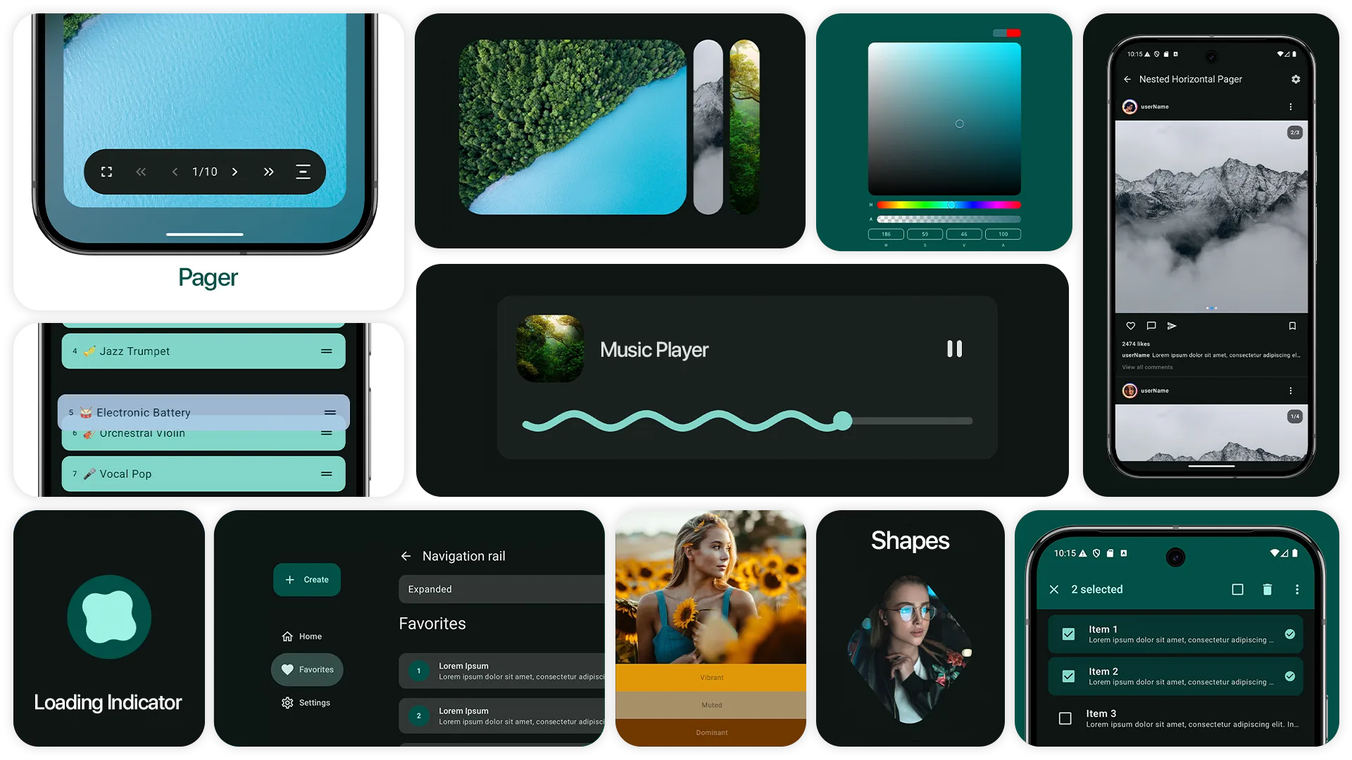
Pager
Horizontal Pager
Vertical Pager
Tabs with Horizontal Pager
Auto Scroll Pager
Multiple Page Per View
Pager Scroll Effects
Animated Background Pager
List
Carousel image galleries
Material list items
Segmented expandable lists
Lazy grids and staggered grids
Pull to refresh lists
Music player list
Video player list
Color palette list
List animations
Selectable lists
Nested lists
Pagination with remote data
Drag & drop reorder
Sticky headers
Shared Element
Clip reveal animations
Image to detail transitions
Navigation shared elements
List to detail transitions
Gallery full screen transitions
App Bars
App bars with scroll effects
Toolbar with animations
Buttons
Filled, outlined and text buttons
Button groups
Split buttons
Assist, filter and input chips
Checkboxes and switches
Icon buttons
Floating Action Buttons
Expandable FAB menus
Pickers
Date pickers
Time pickers
Color picker (HSV & Hex)
Color palette extraction: extract colors from images
Media picker (images, video, GIF)
Loading & Progress
Loading indicators
Linear progress indicators
Circular progress indicators
Text Components
Text fields with validation
Typography styles
Advanced text rendering
Other Components
Sliders
Dialogs
Snackbars
Tooltips
Dropdown menus
Dividers
Images with filters
Shapes
Material cards
Notification badges
Bottom sheets
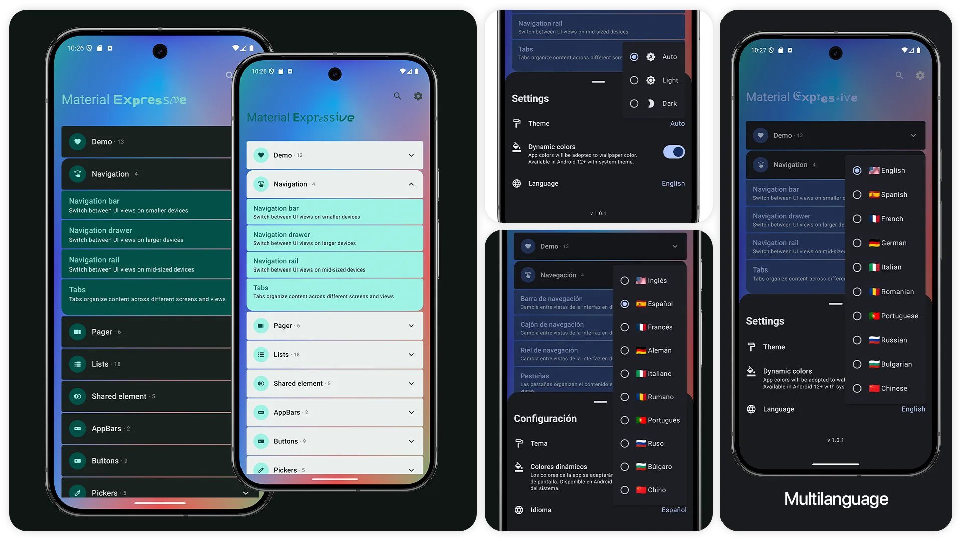
Settings
Theme – Change app theme (light, dark, system)
Dynamic Colors – Enable/disable dynamic colors
Language – Change app language (English, Spanish, French, German, Italian, Portuguese, Russian,
Chinese, Romanian, Bulgarian)
Material 3 Expressive UI/UX for Android is a design and development approach for building Android app interfaces with Kotlin and Jetpack Compose. It uses Material 3 components, layout patterns, color, typography, motion, and adaptive design tools to create consistent screens and interactions. Developers can use it to build interfaces that respond well to different device sizes and user preferences. It is intended for Android developers, UI designers, and product teams creating or updating Android applications with Jetpack Compose.